In conversations with customers, we hear over and over that The iPad Receptionist doesn’t just help their office run more smoothly. It also adds a wow factor to the front desk experience. Well, get ready for even more “wow.” Today, we’re revealing some new look and feel elements throughout the app to impress your visitors even more, and to make sure your iPad Receptionist represents your company well as a modern, professional, and tech-savvy business.
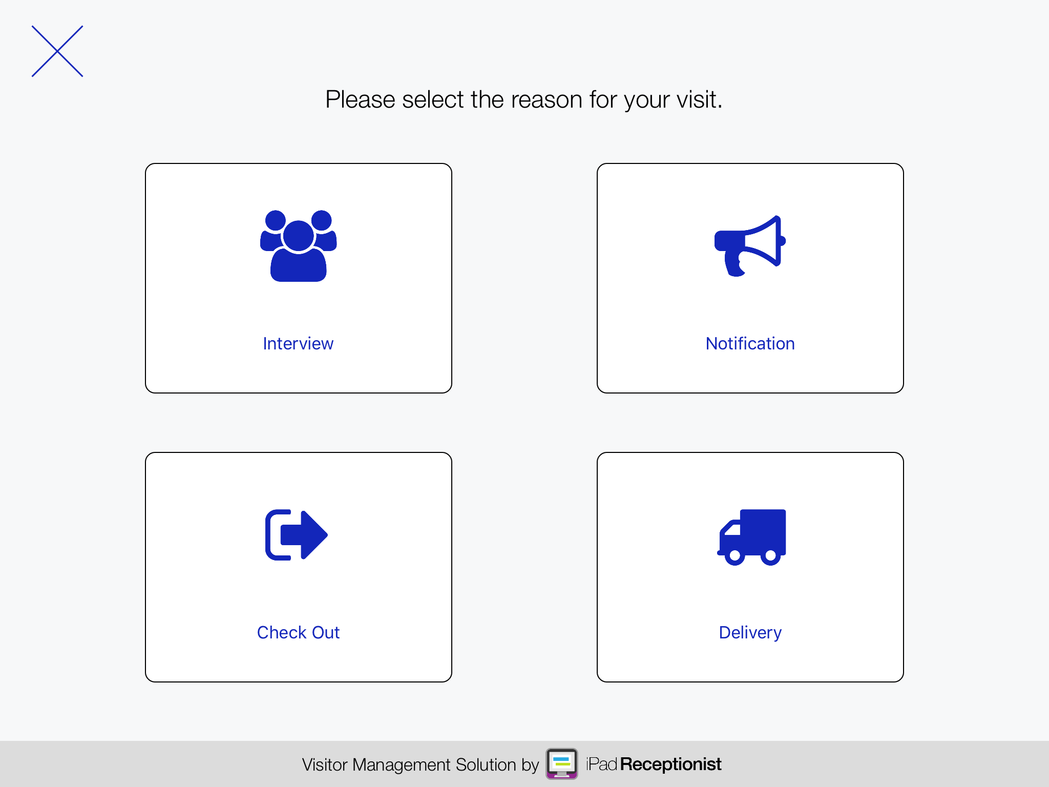
New buttons
Say “hello” to flatter, slimmed-down buttons that will improve your visitor’s first impression of your office. They’ll also allow us to increase the number of buttons available in the future. Don’t worry, you can still set the icon and background color of each button like before. We’re excited to hear what you and your visitors think of the new look! 
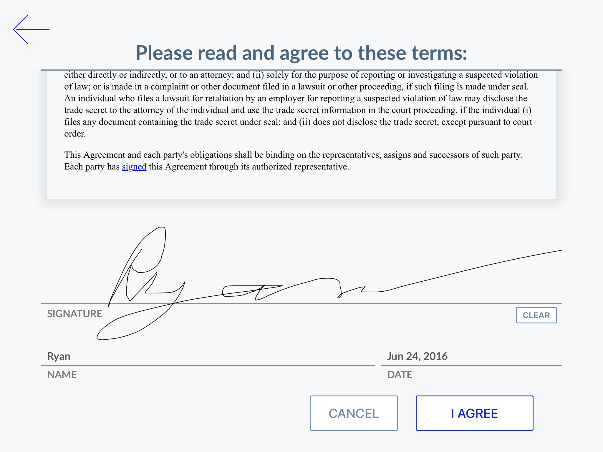
New agreements
Do you use The iPad Receptionist for visitor agreements? Then get excited! We’ve made the interface even easier. The new layout is more intuitive to navigate, which will make the whole agreement-signing process a lot faster for your visitors. 
More upgrades
In addition to new buttons and new agreements, you’ll notice upgrades to almost every corner of the app. We’ve made it easier to do everything from picking a contact to indicating citizenship. Our goal is to help you further elevate your brand image by enhancing the overall look of the first thing your visitors see when they walk in the door. To take advantage of these new elements, just update your app from the app store to version 2.99.4. We hope you enjoy all of these tweaks. If you have any comments or questions, let us know at support@thereceptionist.com. 
Share this Post
